The planner, rebuilt for phone and tablet
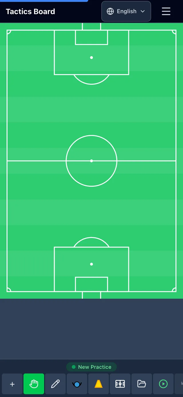
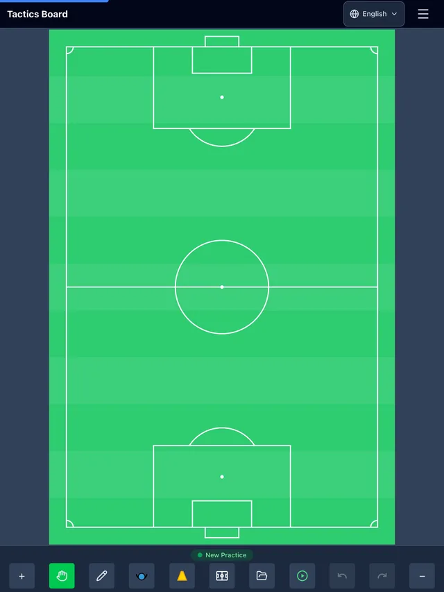
Your phone is the device that comes to the touchline. The Tactics Board planner hasn't paid much attention to that until now: the pitch fitted into the top third of the screen and a form took the rest. Now the pitch fills the screen. You can turn the phone sideways, and the tool menu no longer hides the spot you were about to put a player on.
The pitch fills the screen
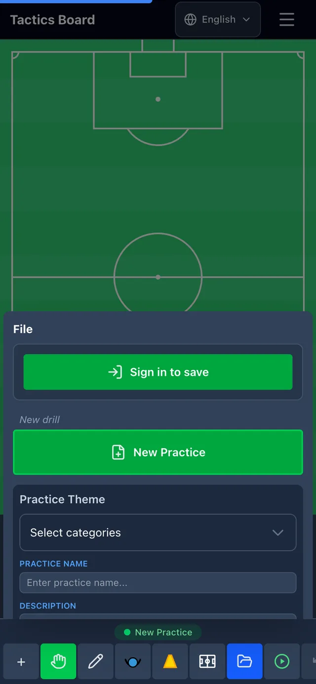
Drill name, description, quality factors and key questions used to sit open below the pitch. You need them when you save a drill, not while you draw it. They're now in the File menu next to saving, and the pitch got the space they were taking.
What you see first changed with them. The starting point used to be an empty rectangle, now it's a marked pitch. On a phone held upright it's a vertical one, which fills that shape without any fiddling.
Turn the phone sideways
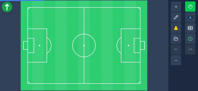
A football pitch is wider than it is tall, and so is a phone held sideways. Turning it used to gain you nothing: the view was built for portrait, and in landscape the pitch ended up a narrow box in the middle of the screen.
Landscape has a layout of its own now. The tools move to a vertical rail on the right in the same order as in portrait, the top bar steps aside, and the pitch takes the rest. You can rotate mid-drill, your drawing stays put.
The template turns with you as long as you haven't drawn anything yet: the vertical pitch becomes a horizontal one. Once there's something on the canvas, the template stays the way you left it.
The pitch stays visible
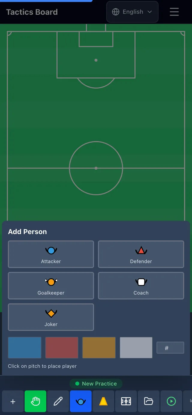
Adding a player takes two steps: pick the type from a menu, then tap the pitch. The menu used to cover the pitch so completely that after picking you couldn't see where you were placing, even though the instruction had just told you to tap the pitch.
The menu is shorter now and the pitch shows through behind it. Once you pick a type the menu shrinks to a slim strip naming what's selected. The pitch and the instruction are visible at the same time.
Smaller fixes
The toolbar icons all come from the same set now. Some of them used to be emoji, which rendered differently on different phones. In the dark theme a few were also close to black on a black background, so in practice invisible.
On a tablet held upright the view mixed the desktop and phone versions together, and a horizontal scrollbar appeared along the bottom. That's fixed too: an iPad in portrait now gets the same view as a phone.
Try it at the touchline
The changes are there without an update or an install. If you keep Tactics Board on your phone's home screen, open it online once so the new version loads.
Drawing itself works as before: two fingers zoom and pan, and touch targets stay large enough to hit even small markers. This update was about how much room the pitch gets.
Tell us how it works on your own phone. The rework was tested on a handful of screen sizes, and there are far more of them at the touchline. If something looks wrong or doesn't work, write to tuki@taktiikkataulu.fi. Say which phone you have and what you were doing, and it gets fixed as soon as we can.